
Every feed eventually has the same problem. It starts as a helpful list of things you might want to know, and it ends as a wall you scroll past on the way to somewhere else.
BlaBlaNote’s home feed was heading there. A birthday you should act on, an AI insight about your network, a follow-up nudge, a team notification, all stacked in one column in reverse chronological order, all looking equally important because they looked identical.
We split it in two.
To-do and Updates
The home feed now has two tabs, and the split is not about topic. It’s about whether you have to do something.
To-do holds the things that need you to act:
- Reconnect — someone in your network has gone quiet past their cadence
- Deadlines — a task with a date approaching
- Important dates — birthdays, work anniversaries, the things that are only useful if you see them in time
- Events — a conference or meeting coming up that you should prepare for
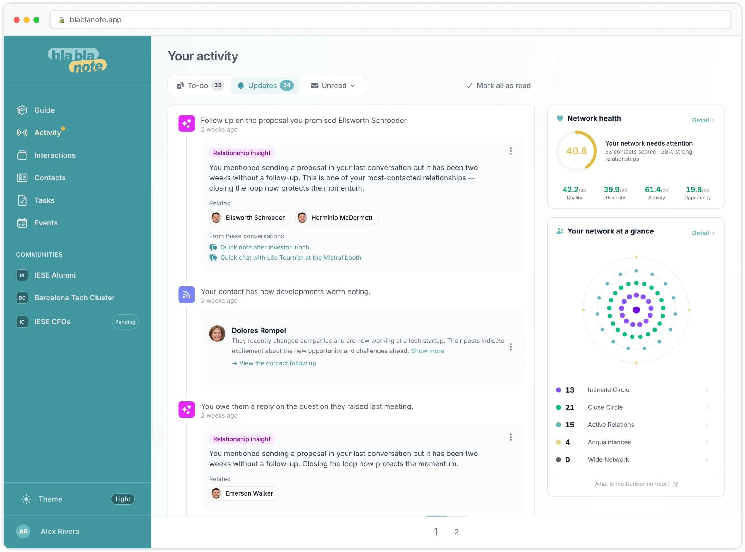
Updates holds the things that are informing you, not asking you:
- Follow-ups — a record of what came out of a conversation
- Insights — what the AI noticed about your network this week
- Notifications — including team notifications, and announcements from us
That’s the whole rule. If ignoring it costs you something, it’s in To-do. If it doesn’t, it’s in Updates.
The number of unread items sits on each tab, so you know at a glance whether you have four things to do or forty things to read.
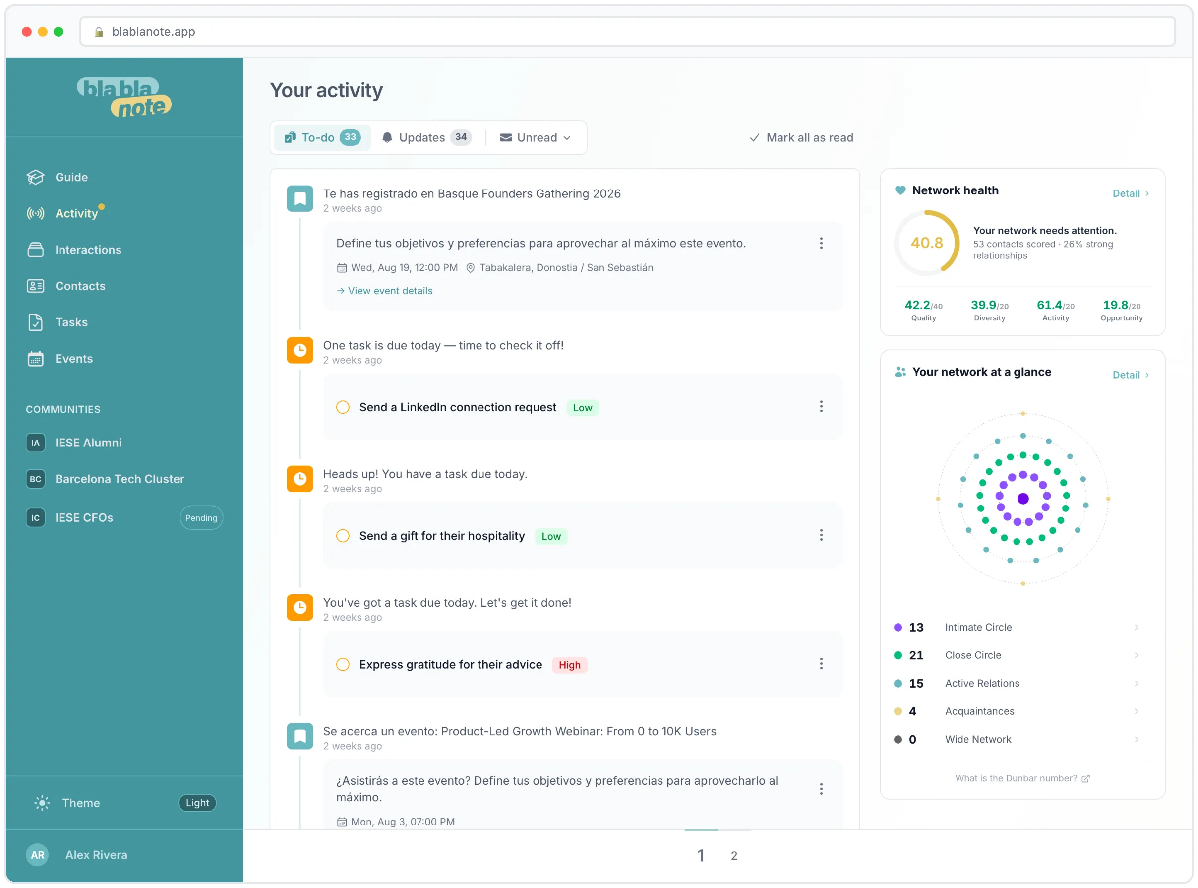
Read and unread, per lane
Each tab has its own unread/read filter and its own mark all as read button, and the mark-all is deliberately scoped to the lane you’re standing in.
This matters more than it sounds. Before, the honest way to clear twelve accumulated Insight cards was to mark everything read, which also cleared the birthday you hadn’t acted on yet. So nobody used it, and the feed just grew. Now you can wipe Updates clean without touching a single thing in To-do, which is what people were trying to do all along.
Switching tabs and filters doesn’t reload the page either. The list and the counters swap in place, scroll position held.
On a phone, the tabs get out of the way
On a narrow screen, the inactive tab collapses to just its icon and the status filter becomes an icon-only dropdown. It’s the iOS convention: the thing you’re doing keeps its label, the thing you’re not doing keeps its shape but gives up its width.
The result is that on a phone, the top of the feed is a small strip instead of a control panel, and the first actual item is visible without scrolling.
And on the side: how your network is actually doing
Alongside the feed there’s now a permanent read on the state of your network. It used to be behind a flag we were testing. It isn’t anymore. Everyone has it.
It shows two things.
A network health score, broken into four dimensions:
- Quality — how strong your relationships are, not how many you have
- Diversity — whether your network is one industry or several
- Activity — whether you’re actually engaging or just accumulating
- Opportunity — connections going dormant that you could still recover
The overall score comes with a one-line verdict, and the verdicts don’t flatter you: your network is in excellent shape, healthy, with room to grow, your network needs attention, your network is underdeveloped. Underneath, how many contacts have been scored and what percentage of them are strong relationships.
Your circles, which is the same idea Dunbar was pointing at, applied to your actual contacts:
- Intimate Circle — your strongest ties
- Close Circle — close, well-maintained relationships
- Active Relations — people you engage with regularly
- Acquaintances — light or occasional contact
- Wide Network — distant or one-off connections
Each has a count. And every one of them is now clickable: tap a circle and the contacts in it open in a sheet, from the bottom on mobile, as a right-hand drawer on desktop. Before, the circles were a number you looked at. Now they’re a way into your contacts list.
That turns out to be the difference between a chart and a tool. “You have 340 acquaintances” is trivia. “Here are your 340 acquaintances, sorted, one tap away” is somewhere to start managing your network.
If your network hasn’t been scored yet
New account, or one where you’ve mostly used BlaBlaNote for notes and haven’t fed it much relationship history? The panel says so instead of showing you an empty chart, and gives you the two things that fix it: import your LinkedIn network or record your first meeting. Scoring starts from there.
Why we didn’t build a smarter feed
The obvious move, when a feed gets noisy, is to make it smarter. Rank it. Put one big AI-chosen card at the top that tells you the single most important thing to do today.
We built that. We ran it behind a flag for a few weeks. Then we removed it.
The problem wasn’t the ranking, which worked fine. It was that a single hero card is a claim: this is the most important thing in your professional life right now. Sometimes it was. Often it was a birthday, sitting above a deadline, because the scorer had no way to know that the deadline mattered and the birthday didn’t. And a confident wrong answer is worse than an honest list, because you stop checking the list.
The split into two lanes does most of what the hero card was trying to do, and it does it by category instead of by guess. What needs you is in one place. What’s just telling you something is in another. You still decide what’s urgent, because you’re still the only one who knows.
Where to find it
It’s already there. Open BlaBlaNote and the home feed has the two tabs. Try clicking one of your circles, it’s the change people notice last and use most.
Not a user yet? Start your free trial and see what your own network health score says. Fair warning: the first one is usually humbling.
